Media Evaluation
1. In what ways does your media product use, develop or challenge forms and conventions of real media products?
Title of my Magazine
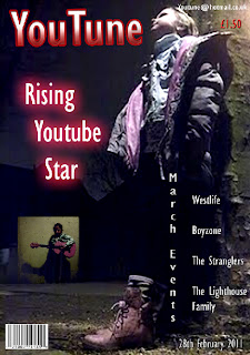
For my magazine title we came up with YouTune, because YouTube is a common place to find music. We thought that we could associate our magazine with YouTube by naming it YouTune and also ‘Tune’ gives the impression that the magazine is a music magazine. I used Gills San MT Condensed for my title and coloured it white and red and the background to be black to make it quite rockish.
Mis-en-scene of Images
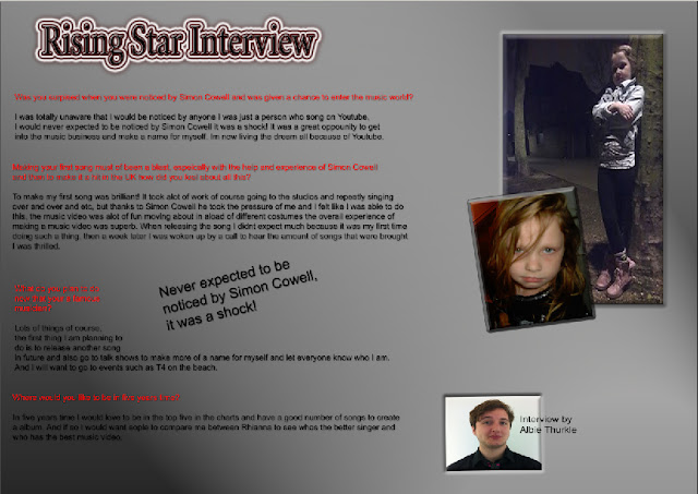
And because the background is black behind the title it has nothing to disrupt it from the viewer’s eyes and also its font size is big enough for it to stand out and be seen. The pictures I have used in my front cover and double page spread tried to be a bit wild and also rocky, for example, my picture on my double page is of a girl with her hair going over her face and then folded arms, leaning on a tree is meant to give the impression of a rock star look. The audience will question who is this girl and why is she out at night, because this is a new magazine it will give a mysterious look.
Costumes and Props
The girl who is in the pictures put on makeup to look like a rock star and also chose what she wore to create that rock star look for the magazine, in the contents page is another person in a suit with an acoustic guitar giving a different look to the magazine.
People
The people that have been featured in my magazine is me, another college person 16 – 17 and the girl aged 7, I don’t think using the girl as a rock star would be the most ideal thing to suit the 14 – 23 age magazine. And looking at other rock magazines it appears that there aren’t just one person on there magazine. I would think my target audience would want 20 year old males all standing together with an electric guitar and such.
Title Font and Style
My text and fonts aren’t what you would see in a rock magazine its more neater and organised then a real rock band magazine but I did want it to be like this so its readable and neat but still has the genre of rock, but some of the editing of the text gives it a bit more of a rock look like my contents title ‘Youtune Highlights’ with the glowing red around the title and also the dark outlining and also the double page spread has the dark red inside and the glowly white outside of the ‘Rising star interview’.
Written Content
The genre I tried giving out in my magazine was rock, the colours red, black and white and also the pictures which the props and costume tried suggesting that it was a rock magazine. And also the magazine is quite dark throughout trying to give out that rock genre look, and also the contents page has an advertisement saying ‘The latest album made by Bullet for my Valentine! Out now.’ This band is a rock band so also through the ad you can tell that this magazine is based on rock.
Layout
The layout of my front page cover is on one side and is the main picture, the other is the headline that is the most important and will be featuring as my double page spread. Making it conventional because this is what you would normally see on a music magazine, like for example the barcode is in the bottom left corner this is a typical thing that you would see on every magazine. Also the same for the double page spread you would normally see one side is the picture and the other is the writing when there is a interview about someone, but for the contents page I would say it’s more different then any other content page because I put the headlines on both sides and also the picture but you would normally see the title at the top and also the message from the editor at the bottom of the contents page.
Contents Page
My contents page isn’t entirely the contents page you would see on the back of a magazine, for example the layout of the headlines are in different areas and I don’t think you would see three pictures combined together on a contents page. But it is still the same with the title and also the editor message.
2. How does your media product represent particular social groups?
My magazine is aimed at 14 – 23 so teenagers to young adults and the type of audience I am aiming at are people who are into rock and also properly YouTube people who commonly use it.
You will have to see the link of the image because the image would not upload in blogger.
Both magazines contain the same colours between them giving the rock look, but the layout for both are totally different, like the main picture of Classic Rock is in the middle and behind the text whilst my image is on the left side, in comparison the Classic Rock has a lot more text then me which I wouldn’t think would be suitable for the my type of audience just short and simple words to make it least boring when it comes to reading.
Also the main headlines for both are the same where they are both places in big fonts and in the centre of attention where everyone can see and read and also stands out from the other parts of the magazine. But the Classic Rock represents more of a hardcore rock audience I would think because of the image they placed is of a man with long hair and leather clothes while my main picture is of a girl leaning on a tree.
3. What kind of media institution might distribute your media product and why?
My magazine can get Sony BMG as a media institution because it is one of the big four music companies and it could feature my magazine because of my magazine is about music and also because my magazine associates with YouTube which is used for music giving it more of a chance to be with Sony BMG.
4. Who would be the audience for your media product?
My media product aims at 14 to 23 year olds all gender and who are into rock. Rock like Bullet for my Valentine, those who enjoy rock and are also got an account on YouTube and enjoying watching videos of other people on YouTube and laughing at hilarious music videos made by others, so they can listen to all music if they read the articles on my magazine. And would be willing to listen to new bands and new singers who are appearing on YouTube and also new professional bands.
5. How did you attract/address your audience?
I attracted my audience with big titles that glowed and caught there eyes just like ‘Rising star interview’ it’s the biggest title on my front cover I want people to read it and become interested in reading that article I have written in my double page spread. And also done my magazine front cover background of the person who is in the rising star article so people look at that image because to me it’s the most important thing on the front cover and that’s what I want them to see.
I chose red because it was the most attractive colour I thought that would be on my front cover choosing blue or green didn’t really match the background so red was the best option to go with, I put all the least important things such as the barcode, price and website out the way into the corners. I didn’t want to fill my front cover with loads of words I think people will be more interested in short and simple and pictures.
My contents page has many pictures to try and keep the audience interested in the contents, also has the most important topics only and describes for the audience what the topics are about in a short simple way so no long reading to know what the topic is about and lose interest. I also put in an advert as well to make the contents more interesting and use up some more space on the contents.
The background of my contents I couldn’t think of, so instead I used lens flare to make my background for my contents by making it go diagonally across my contents page. I kept with my colour scheme for front cover; contents and double page because I liked the red, black and white and think it was the best choice to go with.
With my double page spread I used for my background I used lighting effects to try and give it a bit of stardom look to it because of the title is ‘Rising star interview’ also with the title I gave it a dark look to fit in with the background and have a cool outline glow around it to try and interest my audience. Yet again I kept with my colour scheme with the writing and background and made a quote to try and get into my audiences head ‘Never expected to be noticed by Simon Cowell, it was a shock!’ From the article I think they should remember that because it’s the most important.
6. What have you learnt about technologies from the process of constructing this product?
I have learned a lot about Photoshop while making my music magazine, at first I did not know how to use Photoshop and took me a while to change the font and also change the background, now I have managed to finish my music magazine I believe I know the basics of Photoshop I can still learn more about it still, the biggest things I learned were making my titles glow and looking impressive and also that I could change the contrast and brightness of my pictures.
I also used Blogger to upload my media work onto which was hard at first but after exploring the webpage I was able to learn how to use it and upload my media work.
7. Looking back at your preliminary task, what do you feel you have learnt in the progression from it to the full product?
I have learned a lot since the preliminary task. The biggest achievement I think I learned for this task was Photoshop, I learned how to edit titles to glow and also edit photos to making them much better then before, and instead of using another programme with Photoshop I learned how to make a magazine look professional on the programme and also by looking at other magazines and other people works as a example, expanded my knowledge on loads of new techniques on how to change a magazine.
Learned how to take photos more professionally when making the girl pose in my magazine and laying on the ground to get a low angle shot. So to summarise it I learned from scratch how to use Photoshop on my own and also to take photos more professional for my magazine.


